





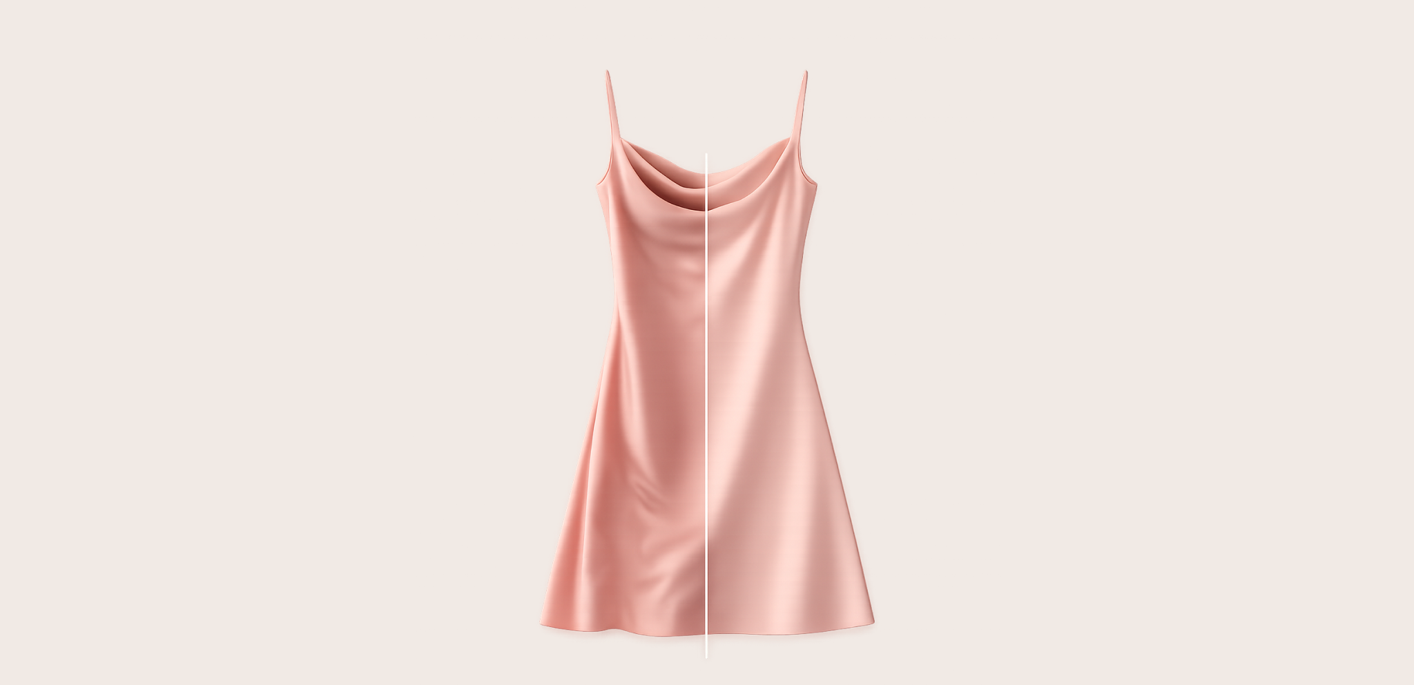
Calzedonia: media management for fashion (enterprise SaaS).
How to make errors to be corrected more evident and save dozens of hours of work.
Summary:
Results achieved:
- Reduction of average media review time by −34%.
- Cut of alignment hours on media management by −60%.
- Decrease in rework cycles by −25% and +18% approved media/week.
Type of work:
Design and development of product features (UX/UI).
Delivery:
Comparison mode with slider and contextual annotations (pins and free drawing) integrated into the Media Library Detail Panel.
Team:
Giacomo Dalia; Warda development team; CPO; Calzedonia client stakeholder (contact: Olena Avramenko).
My role:
UX/UI Designer — discovery with stakeholders, field observation, interaction definition (slider + notes), micro-UI and micro-copy, prototyping, handoff and QA.
Curiosity:
The introduction of the slider allowed us to discover the amount of editing applied in the fashion world. The level of perfection required is sometimes ridiculously absurd for non-technical people.
Introduction:
SeeCommerce is a platform aimed at fashion brands, allowing them to centralize product data, organize catalogs, and manage media in a single environment, up to publication on institutional sites and e-commerce.
In this scenario, product media are an essential piece of the go-live: shooting, post-production, reviews, and approvals must flow smoothly. One of our main clients, Calzedonia, uses SeeCommerce for the entire workflow, and from here emerged the need to compare different versions of the same shot and communicate changes precisely to the retouchers.
I started the work with a comparison with our contact at Calzedonia, Olena Avramenko, observing the team as they compared the shots. From this observation activity, all the main elements that contributed to the project's success emerged.
The work began by observing how Calzedonia specialists reviewed images. SeeCommerce operates with Views: each View represents a type of shot — it can be Shooting or Post-production, coded based on business needs as Still-life, Worn, front or side. Within the same View, various versions of the same shot coexist.
Problem:
Capire le differenze tra una versione e l’altra richiedeva molto tempo e costringeva a continui passaggi manuali da un’immagine all’altra, affidandosi solo all’occhio esperto di chi revisionava.
Solution:
Integrare uno slider di confronto che sovrappone due immagini e consente di scorrere facilmente da una versione all’altra.
Until that moment, approvers were forced to zoom in and manually alternate images to catch differences, even the most subtle ones. A slow, cumbersome process tied to the experience of the individual.
The solution that seemed most natural was to overlay two versions and allow scrolling a central slider to reveal one image on one side and the other on the other side. I designed a lightweight activation directly from the media preview in the right panel. If the user has selected only one media, the interface prompts them to choose a second one to activate the comparison. Initially, I thought of limiting the comparison to the last two versions, but I preferred to leave the possibility of pairing an advanced post-production with the original shooting.
Problem:
The requested corrections were communicated vaguely, through chats or meetings, with great time expenditure and risk of misunderstandings.
Solution:
Introduce a system of contextual annotations directly on the image (colored pins and, later, free drawing) to indicate precisely what to modify.
Once the visual comparison was resolved, a second friction emerged that was perhaps even more impactful: how to communicate precisely what needed to be corrected. Until that moment, observations traveled through generic chats or long meetings: indications like "soften shoulder" or "remove crease" remained vague, not contextualized to the image, and forced several rounds of comparison to truly understand each other. A significant waste of time that slowed publication and increased team frustration.
The first solution we introduced was a system of simple contextual annotations: small colored pins applied directly on the image, each with a text comment and status Open/Resolved. This function has already made the exchange clearer and faster: each feedback was anchored to a precise point of the photo and was visible with the annotation tool active, up to the final correction.
However, after the first tests, a limit emerged: a pin was not always sufficient. Some corrections concerned irregular areas (a long crease, a diffuse reflection, a color halo) difficult to explain with a single point. From here, the next step: free drawing annotations. With a simple stroke, it was possible to circle or highlight directly the area to be corrected.
During the comparison with the slider, the notes did not remain fixed and intrusive: they followed the active image, disappearing when viewing the portion of the alternative version and reappearing upon return. This way, specific feedback from both versions could be read without visual confusion.
To ensure clarity, we then took care of some micro-details: the labels "Shooting" and "Post-Production" always visible, the order of selection indicated by "1" and "2" (essential with similar images), the automatic deactivation of the feature in the absence of a second version, the persistence of notes in the file tab with consultable history. In parallel, I followed the handoff with subsequent QA sessions, addressing edge cases such as different resolutions, orientation, zoom, and drag of the slider, verifying performance and pixel-perfect alignment even on large images (2000×3000 px).
Impacts and results
In the first sprints after the release, the team completed review cycles with an average time reduction of 34% (from the first comparison to the closure of notes). The availability of contextual and tracked feedback cut about 60% of the meeting hours dedicated to alignments and reduced rework cycles with retouchers by 25%. In terms of workload volume, approved media per week grew by about 18%, with adoption of the feature exceeding 85% within two weeks and zero critical incidents post-release.
These results are consistent with Calzedonia's workload — tens of thousands of images per season and ~50 dedicated users — and translated into less operational friction and faster go-live on subsequent collections.
Conclusions
The comparison slider and contextual annotations transformed a process based on intuition and memory into a visual, precise, and collaborative flow. The strength of the solution lies in its simplicity: it lives where it is needed (in the detail panel), activates in a gesture, and respects the team's habits, leaving full freedom to choose which versions to compare.
What worked especially well was the approach: field observation, design of the minimum sufficient interaction, attention to micro-UI (clear labels, selection order), and a technical handoff that covered performance, edge cases, and pixel-perfect alignment.


Calzedonia: media management for fashion (enterprise SaaS).
How to make errors to be corrected more evident and save dozens of hours of work.
Summary:
Results achieved:
- Reduction of average media review time by −34%.
- Cut of alignment hours on media management by −60%.
- Decrease in rework cycles by −25% and +18% approved media/week.
Type of work:
Design and development of product features (UX/UI).
Delivery:
Comparison mode with slider and contextual annotations (pins and free drawing) integrated into the Media Library Detail Panel.
Team:
Giacomo Dalia; Warda development team; CPO; Calzedonia client stakeholder (contact: Olena Avramenko).
My role:
UX/UI Designer — discovery with stakeholders, field observation, interaction definition (slider + notes), micro-UI and micro-copy, prototyping, handoff and QA.
Curiosity:
The introduction of the slider allowed us to discover the amount of editing applied in the fashion world. The level of perfection required is sometimes ridiculously absurd for non-technical people.
Introduction:
SeeCommerce is a platform aimed at fashion brands, allowing them to centralize product data, organize catalogs, and manage media in a single environment, up to publication on institutional sites and e-commerce.
In this scenario, product media are an essential piece of the go-live: shooting, post-production, reviews, and approvals must flow smoothly. One of our main clients, Calzedonia, uses SeeCommerce for the entire workflow, and from here emerged the need to compare different versions of the same shot and communicate changes precisely to the retouchers.
I started the work with a comparison with our contact at Calzedonia, Olena Avramenko, observing the team as they compared the shots. From this observation activity, all the main elements that contributed to the project's success emerged.
The work began by observing how Calzedonia specialists reviewed images. SeeCommerce operates with Views: each View represents a type of shot — it can be Shooting or Post-production, coded based on business needs as Still-life, Worn, front or side. Within the same View, various versions of the same shot coexist.
Problem:
Understanding the differences between one version and another took a lot of time and forced continuous manual transitions from one image to another, relying solely on the expert eye of the reviewer.
Solution:
Integrate a comparison slider that overlays two images and allows easy scrolling from one version to another.
Until that moment, approvers were forced to zoom in and manually alternate images to catch differences, even the most subtle ones. A slow, cumbersome process tied to the experience of the individual.
The solution that seemed most natural was to overlay two versions and allow scrolling a central slider to reveal one image on one side and the other on the other side. I designed a lightweight activation directly from the media preview in the right panel. If the user has selected only one media, the interface prompts them to choose a second one to activate the comparison. Initially, I thought of limiting the comparison to the last two versions, but I preferred to leave the possibility of pairing an advanced post-production with the original shooting.
Problem:
The requested corrections were communicated vaguely, through chats or meetings, with great time expenditure and risk of misunderstandings.
Solution:
Introduce a system of contextual annotations directly on the image (colored pins and, later, free drawing) to indicate precisely what to modify.
Once the visual comparison was resolved, a second friction emerged that was perhaps even more impactful: how to communicate precisely what needed to be corrected. Until that moment, observations traveled through generic chats or long meetings: indications like "soften shoulder" or "remove crease" remained vague, not contextualized to the image, and forced several rounds of comparison to truly understand each other. A significant waste of time that slowed publication and increased team frustration.
The first solution we introduced was a system of simple contextual annotations: small colored pins applied directly on the image, each with a text comment and status Open/Resolved. This function has already made the exchange clearer and faster: each feedback was anchored to a precise point of the photo and was visible with the annotation tool active, up to the final correction.
However, after the first tests, a limit emerged: a pin was not always sufficient. Some corrections concerned irregular areas (a long crease, a diffuse reflection, a color halo) difficult to explain with a single point. From here, the next step: free drawing annotations. With a simple stroke, it was possible to circle or highlight directly the area to be corrected.
During the comparison with the slider, the notes did not remain fixed and intrusive: they followed the active image, disappearing when viewing the portion of the alternative version and reappearing upon return. This way, specific feedback from both versions could be read without visual confusion.
To ensure clarity, we then took care of some micro-details: the labels "Shooting" and "Post-Production" always visible, the order of selection indicated by "1" and "2" (essential with similar images), the automatic deactivation of the feature in the absence of a second version, the persistence of notes in the file tab with consultable history. In parallel, I followed the handoff with subsequent QA sessions, addressing edge cases such as different resolutions, orientation, zoom, and drag of the slider, verifying performance and pixel-perfect alignment even on large images (2000×3000 px).
Impacts and results
In the first sprints after the release, the team completed review cycles with an average time reduction of 34% (from the first comparison to the closure of notes). The availability of contextual and tracked feedback cut about 60% of the meeting hours dedicated to alignments and reduced rework cycles with retouchers by 25%. In terms of workload volume, approved media per week grew by about 18%, with adoption of the feature exceeding 85% within two weeks and zero critical incidents post-release.
These results are consistent with Calzedonia's workload — tens of thousands of images per season and ~50 dedicated users — and translated into less operational friction and faster go-live on subsequent collections.
Conclusions
The comparison slider and contextual annotations transformed a process based on intuition and memory into a visual, precise, and collaborative flow. The strength of the solution lies in its simplicity: it lives where it is needed (in the detail panel), activates in a gesture, and respects the team's habits, leaving full freedom to choose which versions to compare.
What worked especially well was the approach: field observation, design of the minimum sufficient interaction, attention to micro-UI (clear labels, selection order), and a technical handoff that covered performance, edge cases, and pixel-perfect alignment.

Calzedonia: media management for fashion (enterprise SaaS).
How to make errors to be corrected more evident and save dozens of hours of work.
Summary:
Results achieved:
- Reduction of average media review time by −34%.
- Cut of alignment hours on media management by −60%.
- Decrease in rework cycles by −25% and +18% approved media/week.
Type of work:
Design and development of product features (UX/UI).
Delivery:
Comparison mode with slider and contextual annotations (pins and free drawing) integrated into the Media Library Detail Panel.
Team:
Giacomo Dalia; Warda development team; CPO; Calzedonia client stakeholder (contact: Olena Avramenko).
My role:
UX/UI Designer — discovery with stakeholders, field observation, interaction definition (slider + notes), micro-UI and micro-copy, prototyping, handoff and QA.
Curiosity:
The introduction of the slider allowed us to discover the amount of editing applied in the fashion world. The level of perfection required is sometimes ridiculously absurd for non-technical people.
Introduction:
SeeCommerce is a platform aimed at fashion brands, allowing them to centralize product data, organize catalogs, and manage media in a single environment, up to publication on institutional sites and e-commerce.
In this scenario, product media are an essential piece of the go-live: shooting, post-production, reviews, and approvals must flow smoothly. One of our main clients, Calzedonia, uses SeeCommerce for the entire workflow, and from here emerged the need to compare different versions of the same shot and communicate changes precisely to the retouchers.
I started the work with a comparison with our contact at Calzedonia, Olena Avramenko, observing the team as they compared the shots. From this observation activity, all the main elements that contributed to the project's success emerged.
The work began by observing how Calzedonia specialists reviewed images. SeeCommerce operates with Views: each View represents a type of shot — it can be Shooting or Post-production, coded based on business needs as Still-life, Worn, front or side. Within the same View, various versions of the same shot coexist.
Problem:
Understanding the differences between one version and another took a lot of time and forced continuous manual transitions from one image to another, relying solely on the expert eye of the reviewer.
Solution:
Integrate a comparison slider that overlays two images and allows easy scrolling from one version to another.
Until that moment, approvers were forced to zoom in and manually alternate images to catch differences, even the most subtle ones. A slow, cumbersome process tied to the experience of the individual.
The solution that seemed most natural was to overlay two versions and allow scrolling a central slider to reveal one image on one side and the other on the other side. I designed a lightweight activation directly from the media preview in the right panel. If the user has selected only one media, the interface prompts them to choose a second one to activate the comparison. Initially, I thought of limiting the comparison to the last two versions, but I preferred to leave the possibility of pairing an advanced post-production with the original shooting.
Problem:
The requested corrections were communicated vaguely, through chats or meetings, with great time expenditure and risk of misunderstandings.
Solution:
Introduce a system of contextual annotations directly on the image (colored pins and, later, free drawing) to indicate precisely what to modify.
Once the visual comparison was resolved, a second friction emerged that was perhaps even more impactful: how to communicate precisely what needed to be corrected. Until that moment, observations traveled through generic chats or long meetings: indications like "soften shoulder" or "remove crease" remained vague, not contextualized to the image, and forced several rounds of comparison to truly understand each other. A significant waste of time that slowed publication and increased team frustration.
The first solution we introduced was a system of simple contextual annotations: small colored pins applied directly on the image, each with a text comment and status Open/Resolved. This function has already made the exchange clearer and faster: each feedback was anchored to a precise point of the photo and was visible with the annotation tool active, up to the final correction.
However, after the first tests, a limit emerged: a pin was not always sufficient. Some corrections concerned irregular areas (a long crease, a diffuse reflection, a color halo) difficult to explain with a single point. From here, the next step: free drawing annotations. With a simple stroke, it was possible to circle or highlight directly the area to be corrected.
During the comparison with the slider, the notes did not remain fixed and intrusive: they followed the active image, disappearing when viewing the portion of the alternative version and reappearing upon return. This way, specific feedback from both versions could be read without visual confusion.
To ensure clarity, we then took care of some micro-details: the labels "Shooting" and "Post-Production" always visible, the order of selection indicated by "1" and "2" (essential with similar images), the automatic deactivation of the feature in the absence of a second version, the persistence of notes in the file tab with consultable history. In parallel, I followed the handoff with subsequent QA sessions, addressing edge cases such as different resolutions, orientation, zoom, and drag of the slider, verifying performance and pixel-perfect alignment even on large images (2000×3000 px).
Impacts and results
In the first sprints after the release, the team completed review cycles with an average time reduction of 34% (from the first comparison to the closure of notes). The availability of contextual and tracked feedback cut about 60% of the meeting hours dedicated to alignments and reduced rework cycles with retouchers by 25%. In terms of workload volume, approved media per week grew by about 18%, with adoption of the feature exceeding 85% within two weeks and zero critical incidents post-release.
These results are consistent with Calzedonia's workload — tens of thousands of images per season and ~50 dedicated users — and translated into less operational friction and faster go-live on subsequent collections.
Conclusions
The comparison slider and contextual annotations transformed a process based on intuition and memory into a visual, precise, and collaborative flow. The strength of the solution lies in its simplicity: it lives where it is needed (in the detail panel), activates in a gesture, and respects the team's habits, leaving full freedom to choose which versions to compare.
What worked especially well was the approach: field observation, design of the minimum sufficient interaction, attention to micro-UI (clear labels, selection order), and a technical handoff that covered performance, edge cases, and pixel-perfect alignment.