





From support to autonomy: the B2B experience on Bikeen
How to make onboarding more immediate and lighten the workload of agents, improving platform adoption.
Discover the Case Studies
Reduce friction: +3% conversions and -15% support requests in 8 hours.
Bikeen: Professional Profiles page (B2B)
Discover the Case Study
Summary:
Results achieved:
- Redefining the registration flow for commercial users
- Redesigning the Professional Profiles page with greater clarity, targeted messages for merchants, and always visible calls to action.
Team:
Giacomo Dalia, liaising with internal stakeholders.
My role:
UX/UI Designer — comprehensive audit of the existing setup, identifying critical issues, defining the new communication and visual flow.
Introduction:
The collaboration with Bikeen began spontaneously during Design4Startups, the event organized by LeVillage; a time-limited challenge: eight hours to gather insights, interview company representatives, understand the main friction points, and propose a concrete improvement to the experience.
That “compressed” framework had a beneficial effect: it imposed clear priorities and a very pragmatic reading of the problem.
Bikeen.eu is a portal dedicated to the buying and selling of mid-high range bicycles, with a clear goal: to connect those who offer and those who seek — individuals, retailers, e-shops, professionals, and rental points — in a profitable and sustainable ecosystem. The project had (and has) solid foundations: Brand Identity awarded at the Media Star in Milan (2022), a successfully closed crowdfunding round in 2023 with the entry of the Intergea Group Holding and a board that includes former cyclist Filippo Pozzato. A young but already recognized and ambitious reality.
However, behind these achievements, a crucial problem emerged: the platform worked well for individuals but struggled to convince and convert the professional target — small and medium retailers and rental points, key figures for building a truly sustainable ecosystem.
The phases
From the very first analyses, it was clear that the communication of the service towards B2B was not very impactful. The homepage completely mirrored the logic of an e-commerce aimed at individuals, leaving professionals without clear references. There was a lack of information on how to activate a profile, what concrete advantages Bikeen could offer to retailers, and especially how to easily upload and manage listings.
In many cases, this deficiency translated into an extra burden for the company’s sales staff, forced to act as "improvised trainers," engaging in personalized tutorials for each new retailer. An unsustainable model in the long term.
On that first day, we followed a dual track: on one hand, a navigation audit to map blind spots (where does a professional get lost? what information are they looking for and not finding? what CTAs do they see, in what order?); on the other hand, work on tone and content architecture, so that the platform genuinely guided the professional target towards action, without delegating the role of "interpreter" to the sales network.

Reduce friction: +3% conversions and -15% support requests in 8 hours.
Completed in 2023.
Redesign of the homepage and onboarding for professionals, introducing clarity and targeted CTAs.
Result:
B2B conversions +3%, support requests -15%, registration time -8%.
Introduction to the Professional Profiles project
After the initial experience in the hackathon, Bikeen asked me to continue the collaboration with a more structured project focused on the Professional Profiles page: a crucial area, as it represents the entry point for retailers and renters interested in joining the platform and who needed a clear and guided experience.
The preliminary audit highlighted several critical issues: lack of informational hierarchy, ineffective initial claims, hidden or poorly positioned CTAs, difficult-to-decipher cards, and a flow that did not follow the real questions of professional users. It was evident that the page was the result of layers that were no longer coherent with the evolution of the project.
The redesign transformed this scenario. The new page features a clear and direct introductory message, immediately visible advantages, modular and readable sections, constant calls to action, and a narrative structure that guides the potential professional client step by step.
In short, the project allowed a shift from a confusing and poorly readable page to a presentation and conversion tool capable of speaking directly to professionals, while simultaneously lightening the workload of internal agents and strengthening Bikeen's identity as a reference platform for B2B in the cycling sector.
Bikeen: Professional Profiles page (B2B)
Completed in 2023.
We rethought the Professional Profiles page to truly speak to retailers, with clear CTAs and explicit advantages.
Result:
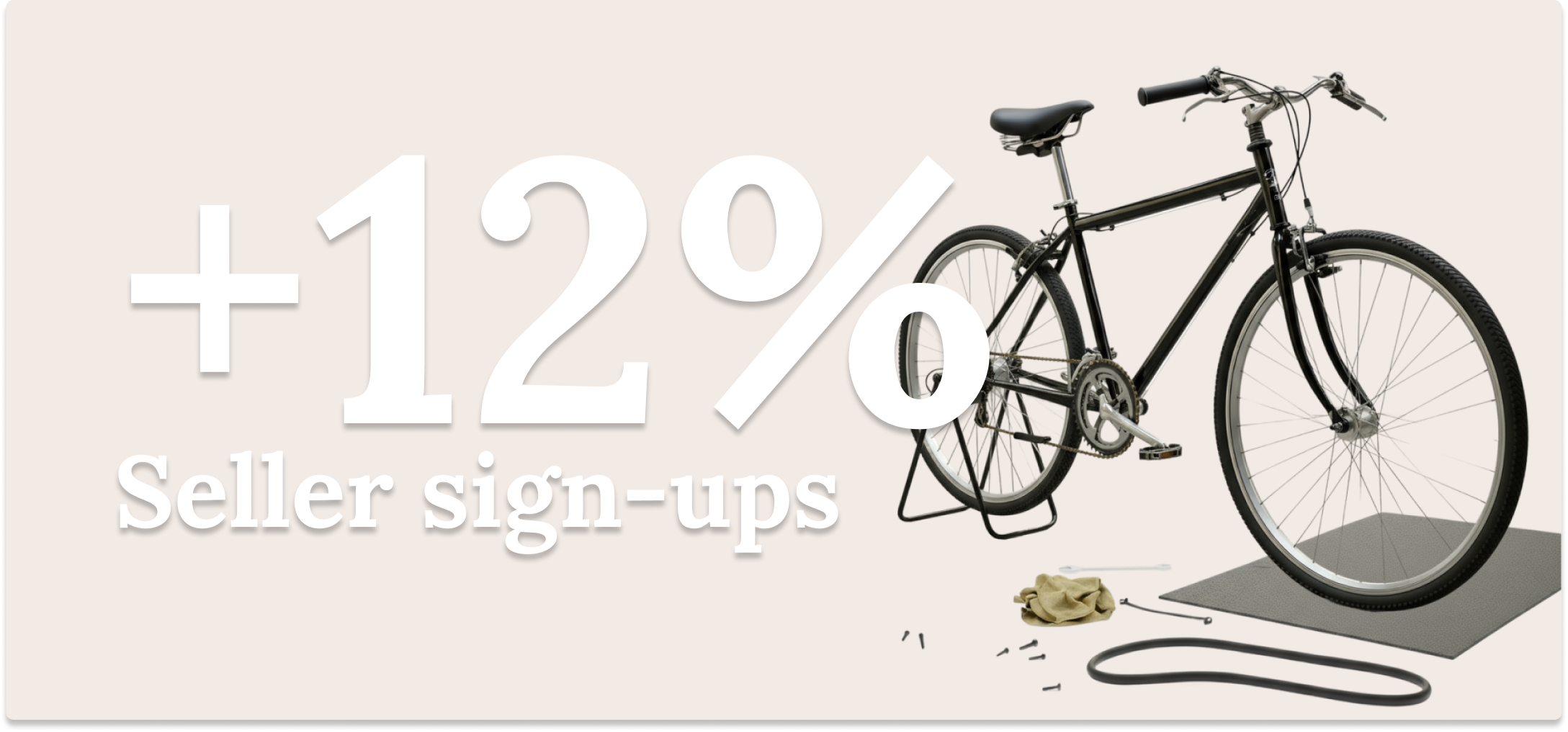
Conversions rose from 15% to 18.5%, while support requests to agents significantly decreased.
Conclusions
Overall, the journey undertaken with Bikeen demonstrated how targeted work on user experience can yield tangible benefits not only in terms of design but also in internal efficiency and service perception.
Surveys collected from sales staff and data from Google Analytics highlighted a 23% increase in the conversion rate of retailers and a reduction of one-third in requests for personalized support following the two interventions.
These metrics, based on internal sources and monitoring tools already in use, show how a well-structured audit and a coherent redesign can lighten processes, improve clarity, and strengthen brand identity.
More generally, the intervention allowed Bikeen to make a significant leap: from a platform perceived as focused on individuals to an ecosystem capable of effectively communicating with the professional target, creating the conditions for a more balanced and sustainable growth.


From support to autonomy: the B2B experience on Bikeen
How to make onboarding more immediate and lighten the workload of agents, improving platform adoption.
Discover the Case Studies
Reduce friction: +3% conversions and -15% support requests in 8 hours.
Bikeen: Professional Profiles page (B2B)
Discover the Case Study
Summary:
Results achieved:
- Redefining the registration flow for commercial users
- Redesigning the Professional Profiles page with greater clarity, targeted messages for merchants, and always visible calls to action.
Team:
Giacomo Dalia, liaising with internal stakeholders.
My role:
UX/UI Designer — comprehensive audit of the existing setup, identifying critical issues, defining the new communication and visual flow.
Introduction:
The collaboration with Bikeen began spontaneously during Design4Startups, the event organized by LeVillage; a time-limited challenge: eight hours to gather insights, interview company representatives, understand the main friction points, and propose a concrete improvement to the experience.
That “compressed” framework had a beneficial effect: it imposed clear priorities and a very pragmatic reading of the problem.
Bikeen.eu is a portal dedicated to the buying and selling of mid-high range bicycles, with a clear goal: to connect those who offer and those who seek — individuals, retailers, e-shops, professionals, and rental points — in a profitable and sustainable ecosystem. The project had (and has) solid foundations: Brand Identity awarded at the Media Star in Milan (2022), a successfully closed crowdfunding round in 2023 with the entry of the Intergea Group Holding and a board that includes former cyclist Filippo Pozzato. A young but already recognized and ambitious reality.
However, behind these achievements, a crucial problem emerged: the platform worked well for individuals but struggled to convince and convert the professional target — small and medium retailers and rental points, key figures for building a truly sustainable ecosystem.
The phases
From the very first analyses, it was clear that the communication of the service towards B2B was not very impactful. The homepage completely mirrored the logic of an e-commerce aimed at individuals, leaving professionals without clear references. There was a lack of information on how to activate a profile, what concrete advantages Bikeen could offer to retailers, and especially how to easily upload and manage listings.
In many cases, this deficiency translated into an extra burden for the company’s sales staff, forced to act as "improvised trainers," engaging in personalized tutorials for each new retailer. An unsustainable model in the long term.
On that first day, we followed a dual track: on one hand, a navigation audit to map blind spots (where does a professional get lost? what information are they looking for and not finding? what CTAs do they see, in what order?); on the other hand, work on tone and content architecture, so that the platform genuinely guided the professional target towards action, without delegating the role of "interpreter" to the sales network.
Reduce friction: +3% conversions and -15% support requests in 8 hours.
Completed in 2023.
Redesign of the homepage and onboarding for professionals, introducing clarity and targeted CTAs.
Result:
B2B conversions +3%, support requests -15%, registration time -8%.
Introduction to the Professional Profiles project
After the initial experience in the hackathon, Bikeen asked me to continue the collaboration with a more structured project focused on the Professional Profiles page: a crucial area, as it represents the entry point for retailers and renters interested in joining the platform and who needed a clear and guided experience.
The preliminary audit highlighted several critical issues: lack of informational hierarchy, ineffective initial claims, hidden or poorly positioned CTAs, difficult-to-decipher cards, and a flow that did not follow the real questions of professional users. It was evident that the page was the result of layers that were no longer coherent with the evolution of the project.
The redesign transformed this scenario. The new page features a clear and direct introductory message, immediately visible advantages, modular and readable sections, constant calls to action, and a narrative structure that guides the potential professional client step by step.
In short, the project allowed a shift from a confusing and poorly readable page to a presentation and conversion tool capable of speaking directly to professionals, while simultaneously lightening the workload of internal agents and strengthening Bikeen's identity as a reference platform for B2B in the cycling sector.
Bikeen: Professional Profiles page (B2B)
Completed in 2023.
We rethought the Professional Profiles page to truly speak to retailers, with clear CTAs and explicit advantages.
Result:
Conversions rose from 15% to 18.5%, while support requests to agents significantly decreased.
Conclusions
Overall, the journey undertaken with Bikeen demonstrated how targeted work on user experience can yield tangible benefits not only in terms of design but also in internal efficiency and service perception.
Surveys collected from sales staff and data from Google Analytics highlighted a 23% increase in the conversion rate of retailers and a reduction of one-third in requests for personalized support following the two interventions.
These metrics, based on internal sources and monitoring tools already in use, show how a well-structured audit and a coherent redesign can lighten processes, improve clarity, and strengthen brand identity.
More generally, the intervention allowed Bikeen to make a significant leap: from a platform perceived as focused on individuals to an ecosystem capable of effectively communicating with the professional target, creating the conditions for a more balanced and sustainable growth.
From support to autonomy: the B2B experience on Bikeen
How to make onboarding more immediate and lighten the workload of agents, improving platform adoption.
Discover the Case Studies
Reduce friction: +3% conversions and -15% support requests in 8 hours.
Bikeen: Professional Profiles page (B2B)
Discover the Case Study
Summary:
Results achieved:
- Redefining the registration flow for commercial users
- Redesigning the Professional Profiles page with greater clarity, targeted messages for merchants, and always visible calls to action.
Team:
Giacomo Dalia, liaising with internal stakeholders.
My role:
UX/UI Designer — comprehensive audit of the existing setup, identifying critical issues, defining the new communication and visual flow.
Introduction:
The collaboration with Bikeen began spontaneously during Design4Startups, the event organized by LeVillage; a time-limited challenge: eight hours to gather insights, interview company representatives, understand the main friction points, and propose a concrete improvement to the experience.
That “compressed” framework had a beneficial effect: it imposed clear priorities and a very pragmatic reading of the problem.
Bikeen.eu is a portal dedicated to the buying and selling of mid-high range bicycles, with a clear goal: to connect those who offer and those who seek — individuals, retailers, e-shops, professionals, and rental points — in a profitable and sustainable ecosystem. The project had (and has) solid foundations: Brand Identity awarded at the Media Star in Milan (2022), a successfully closed crowdfunding round in 2023 with the entry of the Intergea Group Holding and a board that includes former cyclist Filippo Pozzato. A young but already recognized and ambitious reality.
However, behind these achievements, a crucial problem emerged: the platform worked well for individuals but struggled to convince and convert the professional target — small and medium retailers and rental points, key figures for building a truly sustainable ecosystem.
The phases
From the very first analyses, it was clear that the communication of the service towards B2B was not very impactful. The homepage completely mirrored the logic of an e-commerce aimed at individuals, leaving professionals without clear references. There was a lack of information on how to activate a profile, what concrete advantages Bikeen could offer to retailers, and especially how to easily upload and manage listings.
In many cases, this deficiency translated into an extra burden for the company’s sales staff, forced to act as "improvised trainers," engaging in personalized tutorials for each new retailer. An unsustainable model in the long term.
On that first day, we followed a dual track: on one hand, a navigation audit to map blind spots (where does a professional get lost? what information are they looking for and not finding? what CTAs do they see, in what order?); on the other hand, work on tone and content architecture, so that the platform genuinely guided the professional target towards action, without delegating the role of "interpreter" to the sales network.
Reduce friction: +3% conversions and -15% support requests in 8 hours.
Completed in 2023.
Redesign of the homepage and onboarding for professionals, introducing clarity and targeted CTAs.
Result:
B2B conversions +3%, support requests -15%, registration time -8%.
Introduction to the Professional Profiles project
After the initial experience in the hackathon, Bikeen asked me to continue the collaboration with a more structured project focused on the Professional Profiles page: a crucial area, as it represents the entry point for retailers and renters interested in joining the platform and who needed a clear and guided experience.
The preliminary audit highlighted several critical issues: lack of informational hierarchy, ineffective initial claims, hidden or poorly positioned CTAs, difficult-to-decipher cards, and a flow that did not follow the real questions of professional users. It was evident that the page was the result of layers that were no longer coherent with the evolution of the project.
The redesign transformed this scenario. The new page features a clear and direct introductory message, immediately visible advantages, modular and readable sections, constant calls to action, and a narrative structure that guides the potential professional client step by step.
In short, the project allowed a shift from a confusing and poorly readable page to a presentation and conversion tool capable of speaking directly to professionals, while simultaneously lightening the workload of internal agents and strengthening Bikeen's identity as a reference platform for B2B in the cycling sector.
Bikeen: Professional Profiles page (B2B)
Completed in 2023.
We rethought the Professional Profiles page to truly speak to retailers, with clear CTAs and explicit advantages.
Result:
Conversions rose from 15% to 18.5%, while support requests to agents significantly decreased.
Conclusions
Overall, the journey undertaken with Bikeen demonstrated how targeted work on user experience can yield tangible benefits not only in terms of design but also in internal efficiency and service perception.
Surveys collected from sales staff and data from Google Analytics highlighted a 23% increase in the conversion rate of retailers and a reduction of one-third in requests for personalized support following the two interventions.
These metrics, based on internal sources and monitoring tools already in use, show how a well-structured audit and a coherent redesign can lighten processes, improve clarity, and strengthen brand identity.
More generally, the intervention allowed Bikeen to make a significant leap: from a platform perceived as focused on individuals to an ecosystem capable of effectively communicating with the professional target, creating the conditions for a more balanced and sustainable growth.